Metadata driven UI
metadata.RmdMotivation
We wanted to create a unified way to add filters and controls for all our plots in the front end. Previously there were different approaches to this for each plot but we wanted to create a unified way to reduce code duplication, make the interface consistent and mean enhancements to one plot can easily be ported over to all others. The drop downs in the side bar are split into two sections, plot controls and filters.
-
controls- dropdowns that influence other dropdowns -
filters- dropdowns that act as filters for slicing the data
The controls can run effects to modify the
filters such as:
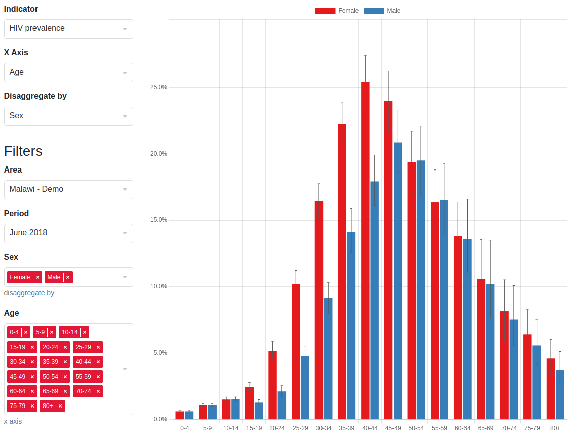
- Set specific filters as multi-selects. For example, in the barchart
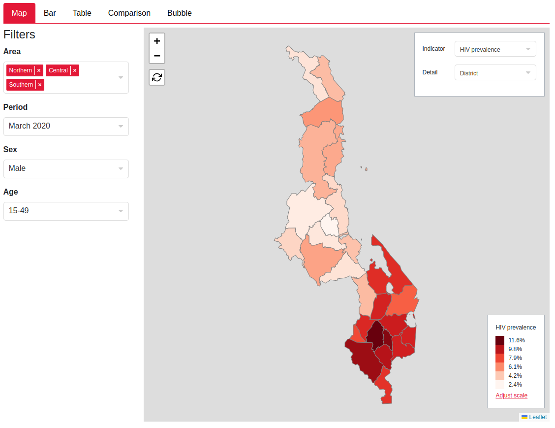
users can select an
X AxisandDisaggregate bycontrols which set whatever is selected into a multi-select dropdown, while keeping the rest as single selects. See barchart screenshot - Set selected value for a filter e.g. if users select an indicator we might want to select specific sex and age groups which have data for this indicator e.g. ANC indicators should be female and 15-49.
- Set filters e.g. ART data has a column for period, ANC data has a column for year, we want to show the period for filter for ART only and the year filter for ANC only
- Filters can be hidden if we want to simplify the UI to remove clutter for users whilst ensuring we still filter the underlying data
- Set custom effects that the plot impl can pick up on and use to control the plot UI e.g. in the table we have a custom effect which defines for each control what is displayed as a header and as a row in the table view.
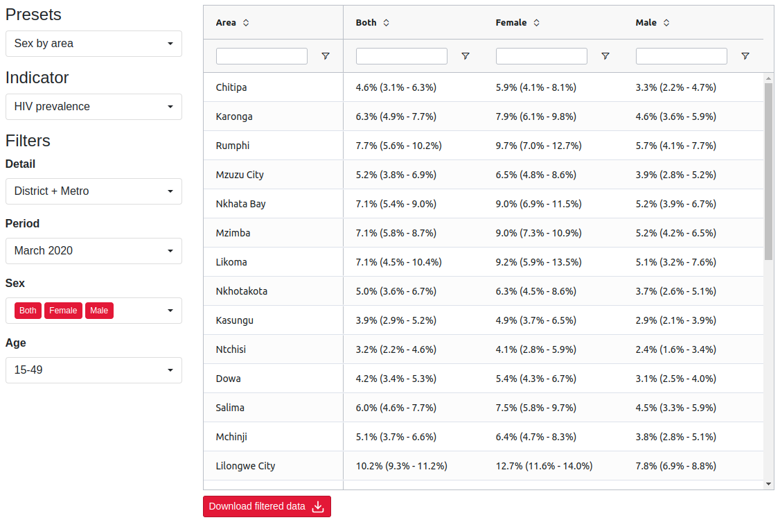
Below are some examples of the plot control and filter UIs that the metadata allow us to build
Implementation overview
The backend (this repository) provides metadata JSON endpoints that tell the frontend how to construct the UI and also how to dynamically update it based on the value of the dropdowns.
For details on where metadata is currently served from see Endpoints section.
Reminder that there are two types of dropdowns that can be created via metadata:
- Dropdowns that influence other dropdowns - we will call these
controlsand call their valuessettings - Dropdowns that acts as filters for slicing the data - we will call
these
filtersand their valuesselections
Here is a useful visualisation of the schema that I’ll keep referring
to so that we don’t get lost in the JSON nesting (note that
indicators is not expanded as this just contains metadata
about the indicator values such as their format which isn’t relevant to
the metadata structure):
├── filterTypes[]
│   ├── id
│   ├── column_id
│   ├── use_shape_regions
│   ├── options[]
│   │   ├── label
│   │   ├── id
│   │   ├── description
├── indicators
├── plotSettingsControl{}
│   ├── defaultEffect
│   │   ├── setFilters
│   │   ├── ... (see effect below)
│   ├── plotSettings[]
│   │   ├── label
│   │   ├── id
│   │   ├── hidden
│   │   ├── value
│   │   ├── options[]
│   │   │   │   ├── id
│   │   │   │   ├── label
│   │   │   │   ├── effect
│   │   │   │   │   ├── setFilters
│   │   │   │   │   ├── setMultiple
│   │   │   │   │   ├── setFilterValues
│   │   │   │   │   ├── setHidden
│   │   │   │   │   ├── customPlotEffect
This is just a full version of the json schema.
Filters
├── filterTypes[] # here
│   ├── id # 1
│   ├── column_id # 2
│   ├── use_shape_regions # 3
│   ├── options[] # 4
│   │   ├── label
│   │   ├── id
│   │   ├── description
├── indicators
├── plotSettingsControl{}
│   ├── defaultEffect
│   │   ├── setFilters
│   │   ├── ... (see effect below)
│   ├── plotSettings[]
│   │   ├── label
│   │   ├── id
│   │   ├── hidden
│   │   ├── value
│   │   ├── options[]
│   │   │   │   ├── id
│   │   │   │   ├── label
│   │   │   │   ├── effect
│   │   │   │   │   ├── setFilters
│   │   │   │   │   ├── setMultiple
│   │   │   │   │   ├── setFilterValues
│   │   │   │   │   ├── setHidden
│   │   │   │   │   ├── customPlotEffect
The filterTypes key is the simplest. It is an array of
all the filters that can be displayed in the UI with their options.
Explanations for each number in the visualisation:
- The
idis just an id we can assign to the filter to refer to it later - The
column_idthis is the column id of the data which we have to filter -
use_shape_regionsis a boolean that should largely be ignored, it is a one off trick for geographical area filters only to reduce the amount of payload we send to the frontend by telling it to derive the options of a filter select with this boolean from the shape file that the user has uploaded - The
optionsare the options visible to the user in the dropdown. Each option has anidby which filter selections can refer to the option, alabelto display in the dropdown menu and an optionaldescriptionprop for contextual information (this doesn’t get displayed to the user at all)
Plot Settings Control
├── filterTypes[]
│   ├── id
│   ├── column_id
│   ├── use_shape_regions
│   ├── options[]
│   │   ├── label
│   │   ├── id
│   │   ├── description
├── indicators
├── plotSettingsControl{} # here
│   ├── defaultEffect # 1
│   │   ├── setFilters
│   │   ├── ... (see effect below)
│   ├── plotSettings[] # 2
│   │   ├── label # 3
│   │   ├── id # 4
│   │   ├── hidden # 5
│   │   ├── value # 6
│   │   ├── options[]
│   │   │   │   ├── id # a
│   │   │   │   ├── label
│   │   │   │   ├── effect
│   │   │   │   │   ├── setFilters
│   │   │   │   │   ├── setMultiple
│   │   │   │   │   ├── setFilterValues
│   │   │   │   │   ├── setHidden
│   │   │   │   │   ├── customPlotEffect
The plot settings controls is an object with keys of the relevant
plot name (e.g. choropleth) and value with the structure
shown in the visualisation. Explanation of keys:
-
defaultEffectis the base effect applied to allsettings(remember these are the values of thecontroldropdown) - more on this later -
plotSettingsis an array of all thecontrolsa tab will have -
labelis the title of the dropdown the user will see in the UI -
idis the id of the plot settings (this id is how the store keeps track of whichsettingof thecontrolis selected) -
hiddenboolean - there are times we want thecontrolto be invisible. The calibrate plot reuses the barchart component, however they expect anX AxisandDisaggregate bycontrol - these controls are fixed in the calibrate plot so we set them to a constant value and hide them from the user allowing us to reuse the barchart component without any special code -
valueis an optional key to set the default value of thecontrolas something other than the default (default in frontend for single select is the first value and for a multi-select is all the values). This is theidof the option (ain the visualisation)
Settings
├── filterTypes[]
│   ├── id
│   ├── column_id
│   ├── use_shape_regions
│   ├── options[]
│   │   ├── label
│   │   ├── id
│   │   ├── description
├── indicators
├── plotSettingsControl{}
│   ├── defaultEffect
│   │   ├── setFilters
│   │   ├── ... (see effect below)
│   ├── plotSettings[]
│   │   ├── label
│   │   ├── id
│   │   ├── hidden
│   │   ├── value
│   │   ├── options[] # here
│   │   │   │   ├── id # 1
│   │   │   │   ├── label # 2
│   │   │   │   ├── effect # 3
│   │   │   │   │   ├── setFilters
│   │   │   │   │   ├── setMultiple
│   │   │   │   │   ├── setFilterValues
│   │   │   │   │   ├── setHidden
│   │   │   │   │   ├── customPlotEffect
The settings completely determine the
filters and their selections. The next section
will go through each effect and how the frontend resolves it but for
now, explanation of keys:
-
idfor the store to record whatsettingis chosen -
labeldisplayed to the user in the dropdown menu - The
effectkey is probably the most important idea here. Everysettinghas an effect associated with it and aggregating all the effects along all the settings the user has chosen completely determines thefiltersand their initialselectionsthat are shown to the user. So everything can be derived from just thesettingsthat are chosen
Effects
Effects are the actions that can be undertaken when a plot control is selected. They can be used to modify the filters and set custom effects which can be used by the plot.
├── filterTypes[]
│   ├── id # a
│   ├── column_id
│   ├── use_shape_regions
│   ├── options[]
│   │   ├── label
│   │   ├── id # b
│   │   ├── description
├── indicators
├── plotSettingsControl{}
│   ├── defaultEffect # (here as well)
│   │   ├── setFilters
│   │   ├── ... (see effect below)
│   ├── plotSettings[]
│   │   ├── label
│   │   ├── id
│   │   ├── hidden
│   │   ├── value
│   │   ├── options[]
│   │   │   │   ├── id
│   │   │   │   ├── label
│   │   │   │   ├── effect # here
│   │   │   │   │   ├── setFilters
│   │   │   │   │   ├── setMultiple
│   │   │   │   │   ├── setFilterValues
│   │   │   │   │   ├── setHidden
│   │   │   │   │   ├── customPlotEffect
For this section we will need a more detailed view of the effects structure:
├── setFilters[] # 1
│   ├── filterId # 1.1
│   ├── label # 1.2
│   ├── stateFilterId # 1.3
├── setMultiple[] # 2
├── setFilterValues{} # 3
├── setHidden[] # 4
├── customPlotEffect{} # 5
Explanation of each effect and how the frontend aggregates this:
-
setFiltersis how the effect specifies whatfiltersthe user sees from thefilterTypes. Only onesetFilterseffect is used, they are not combined. So if twosettingsset filters, the lastsetFiltersin the for loop would be used when going through all thesettings. Keys:-
filterIdis theidkey in afilterTypeselement (ain the schema above) -
labelis the title of thefilterdisplayed to the user in the UI -
stateFilterIdis the id the state uses to identify this filter. This is distinct to thefilterIdbecause in the bubble plot we have two indicators filters that are the same filter type (so have the sameoptionsand the samecolumn_id) however they are distinct because one controls the color of the bubbles and one controls the size of the bubbles so while both theirfilterIds areindicator, thestateFilterIds for both are different,colorIndicatorandsizeIndicator. For most cases this can be set as the same thing as thefilterId. All other effects will now identify filters bystateFilterIdas these uniquely correspond to what the user sees
-
-
setMultipleis an effect that converts afilterto a multi-select dropdown (they are all single select by default). It is an array ofstateFilterIds (1.3in the schema) This is aggregated via concatenation in the frontend so if two settings havesetMultipleproperties["state_id_1", "state_id_2"]and["state_id_3"]respectively then all three filters with those state ids will be set to multi-selects -
setFilterValuesis an effect that sets the selection of the filters insetFilters. It is an object with keys equal tostateFilterIdand value an array of ids of theselections(bin the schema). Note this is still an array of length one if you want to specify a value for a single select filter. This is aggregated by the spread operator in the frontend -
setHiddenis an effect that hidesfiltersand is usually used when we have a fixed filter that we don’t want the user to change but is still required to slice the data. This is aggregated via concatenation in the frontend -
customPlotEffectis an effect that plots can use to build reactive UI from for a specific plot type. At the moment we are only using this in the table, so set the row and header groups. But it could be expanded to general metadata which we want a plot control to update, but does not have an effect on the filters themselves.
stateFilterId vs filterId
To hammer it home for Rob because he can’t remember this no matter
how many times he reads it. FilterRefs have a
filterId and stateFilterId
-
filterId- used to identify theidin the full set offiltersi.e. to get the label and options for this filter -
stateFilterId- reference to this filter within the rest of the metadata and the effects i.e. to identify which drop down to update when a plot control changes
This is because on the bubble plot, there are two drop downs which
have indicator as their options, but run different
effects.
Typescript definition and derived frontend store
I have used the directory-structure-esque visualisation for most of
this because it is simple and obscures a lot of the types and other
information as that would be too much to throw. But now that you know
how the metadata works, here is the full typescript definition of it
with contextual types (instead of just string, it shows
which type of string it refers to, e.g. whether it is
stateFilterId or filterId):
type FilterId = string
type StateFilterId = string
type ColumnId = string
type SelectionId = string
type PlotControlId = string
type PlotSettingId = string
type PlotName = string

type FilterOption = {
    id: SelectionId,
    label: string,
    description: string
}

type FilterType = {
    id: FilterId,
    column_id: ColumnId,
    options: FilterOption[]
}

type FilterRef = {
    filterId: FilterId,
    label: string,
    stateFilterId: StateFilterId
}

type PlotSettingEffect = {
    setFilters?: FilterRef[],
    setMultiple?: StateFilterId[],
    setFilterValues?: Record<StateFilterId, SelectionId[]>,
    setHidden?: StateFilterId[],
    customPlotEffect?: any
}

type PlotSettingOption = {
    id: PlotSettingId,
    label: string,
    effect: PlotSettingEffect
}

type PlotSetting = {
    id: PlotControlId,
    label: string,
    hidden?: boolean,
    value?: PlotSettingId,
    options: PlotSettingOption[]
}

type PlotSettingsControl = {
    defaultEffect: PlotSettingEffect,
    plotSettings: PlotSetting[]
}

type MetadataStructure = {
    filterTypes: FilterType[],
    indicators: any, // irrelevant
    plotSettingsControl: {
        // example of plotName can be choropleth or table, etc
        [plotName: PlotName]: PlotSettingsControl
    }
}
Selections state
Remember the frontend store is also fully derived from this metadata.
Nothing is hardcoded in the store expect for the plotNames
so the derived store takes the type:
type FilterSelection = {
    multiple: boolean
    selection: FilterOption[],
    hidden: boolean
} & FilterRef

type ControlSelection = {
    id: PlotControlId,
    label: string,
    selection: FilterOption[]
}

type FrontendSelectionState = {
    // these plotNames keys in the type are the generated keys from
    // the json schema in Hintr
    [plotName: PlotName]: {
        controls: ControlSelection[]
        filters: FilterSelection[]
    }
} & { error: Error }
Note that the state stores some extra information other than the
selections of each of the dropdowns, this is to reduce the need to parse
the metadata all the time. However, every time an update to the
controls occurs. the frontend has to parse the metadata,
aggregate all the effects and dynamically render all the filters again.
In practice this is very fast.
Endpoints
For each data source in the frontend UI there is a different endpoint and associated JSON schema that specifies the metadata. Note this will probably go stale but should give a starting point
| Step | Plot | Data source | Metadata source | Schema |
|---|---|---|---|---|
| Input review | Time series | /chart-data/input-time-series/<anc/art> |
/review-input/metadata |
Review inputs |
| Input review | Choropleth | /validate/survey-and-programme |
/review-input/metadata |
Review inputs |
| Input review | Comparison table | /chart-data/input-comparison |
/chart-data/input-comparison |
Input comparison |
| Input review | Comparison barchart | /chart-data/input-comparison |
/chart-data/input-comparison |
Input comparison |
| Input review | Population |
/validate/baseline-individual only for population
data |
/chart-data/input-population |
Input population |
| Calibrate | Calibration barchart | /calibrate/plot/<id> |
/calibrate/plot/<id> |
Calibrate plot |
| Output review | Choropleth |
/calibrate/result/path/<id> (*) |
/calibrate/result/metadata/<id> |
Review output |
| Output review | Barchart |
/calibrate/result/path/<id> (*) |
/calibrate/result/metadata/<id> |
Review output |
| Output review | Choropleth |
/calibrate/result/path/<id> (*) |
/calibrate/result/metadata/<id> |
Review output |
| Output review | Table |
/calibrate/result/path/<id> (*) |
/calibrate/result/metadata/<id> |
Review output |
| Output review | Comparison | /comparison/plot/<id> |
/comparison/plot/<id> |
Output comparison |
| Output review | Bubble |
/calibrate/result/path/<id> (*) |
/calibrate/result/metadata/<id> |
Review output |
| Output review | Cascade |
/calibrate/result/path/<id> (*) |
/calibrate/result/metadata/<id> |
Review output |
(*) Kotlin backend gets the path to the duckdb output file using
hintr endpoint at /calibrate/result/path/<id>. It
then slices this using SQL based on the filters the user set in the
front end. So we only return the slice of data the user is looking
at.
Note that data and metadata can be in the same endpoint or different ones. Favour returning them from the same endpoint unless splitting them up will significantly speed up the UI e.g. returning metadata for output plots all together saves reading the output and building the filters from this multiple times. In general, I think having the data & metadata returned together is simpler.
Front end implementation
This section gives an overview of how the front end handles the metadata and where any custom logic for a specific plot should be injected. The aim of the front end impl is that the wiring up of state will be as straight forward as possible, and we get as much code use as possible.
Overview
Data fetching
For output plots data is fetched on demand when
users set filters, therefore there is no big blob of data in state
For all other plots data is pre-fetched via a store
action. This might be when an input file is uploaded (e.g. population,
survey, ART, ANC), or when a plot is opened e.g. input comparison, input
time series. Data is fetched via an action and saved in the store state
somewhere, this varies from data source to data source but will be in
baseline, surveyAndProgramme,
reviewInput
Metadata fetching
Metadata is fetched via a store action which calls to endpoints in
the table above. It can be fetched as part of the same endpoint as the
data, or separately. When metadata is fetched separately we typically do
a couple of modifications before saving it into the store. Firstly, if
the data has use_shape_regions or
use_shape_area_level set we fill in these filter options
from those already in state. We also commit the initial selections, this
runs any default effects and saves them resulting controls and filters
into plotSelections state, it also runs
getPlotData which manges running the plot-specific
filtering logic and saves this into the plotData state.
On mount
The plot should have a prop which is of type PlotName.
It should then read the metadata via the
getMetadataFromPlotName helper and use the data from
plotData state. For each specific plot, it should then
modify the plotData into a structure which can be used by
plot component. Potentially using metadata if it needs, including any
customPlotEffects for the selection.
Adding new plot
If you are using an existing data source or metadata source, you will need to
- Add metadata into existing endpoint or new endpoint
- If a new endpoint, add an action which fetched the metadata, runs
filtersAfterUseShapeRegionsandcommitPlotDefaultSelections. - Add the new plot type into
PlotName - Add handling for new plot type into
getMetadataFromPlotName, it should just map to the location of the metadata - Add handling for new plot type into
getPlotData, if this is using a new data source, write a function to do the filtering for this data source, and run any specific logic for this data source type. - Write the component pulling data from
plotDatastate and metadata viagetMetadataFromPlotName.
Where do I write custom logic?
Modify the metadata before it is ever used, write it in the action after the data is fetched and before it saved to state. For example, setting options for a filter to those from the shape file.
Customise the filter logic, write it in one of the
function getPlotData calls to. For example can use this to
switch between different data sources in one plot (time series), derive
some data from selections (population data gets aggregated to selected
level)
Modify selections when a plot control changes, hook
into the filtering logic, you can do this in
handlePlotControlOverrides. We have used this to set x-axis
for the comparison barchart. Plot selections cannot by default update
other plot selections, but we wanted this for the comparison barchart.
We wanted the UI to show a “plot type” control but not let users modify
the x-axis because they could easily break the display. Instead we have
a hidden x-axis and then hook into the filtering logic to set the x-axis
control if the “plot control” is changed. This one I think we should be
careful with, if we spot common overrides we should think about
refactoring this into an effect.
Modify the plot itself based on a plot control, use
a customPlotEffect to set metadata for this specific plot
selection e.g. for the table we specify in customPlotEffect
what category in the data should be a column group or shown in the
rows.